The product challenge
A first-time visitor needs specific answers: where to go, when to arrive and how to behave. The website needs to support that visit while leaving room for people who want to explore the background.
What we built
- Structured the website around first-time visitor questions: directions, timing, the venue and etiquette.
- Brought photographs, historical context and common questions together in a coherent reading journey.
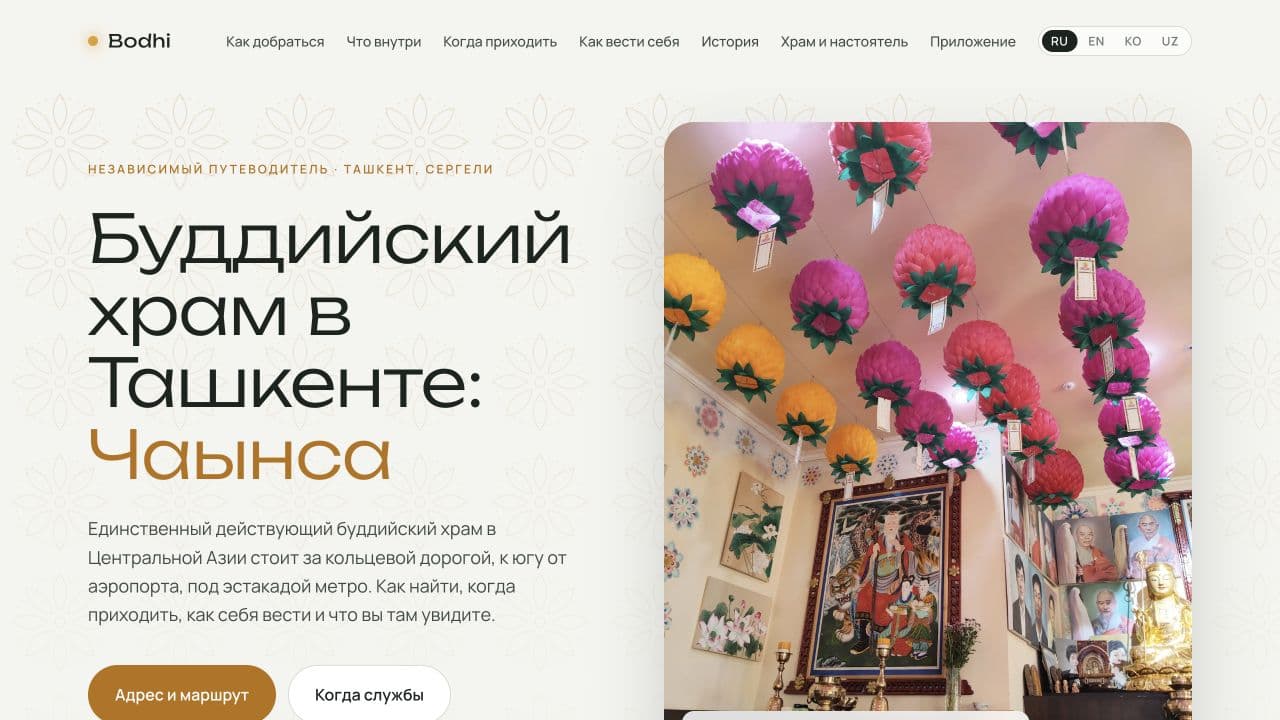
- Added Russian, English, Korean and Uzbek, links to maps and a section introducing the Bodhi app.
Product decisions
Navigation around visitor questions
Directions, the space, visiting times and etiquette each have a dedicated section. The opening screen highlights the address and services before the longer historical account.
A sense of place
Photographs introduce the surroundings while distinct text sections support reading in small parts. Reference information and atmosphere can coexist without competing for the same screen.
Languages and a next step
The guide offers Russian, English, Korean and Uzbek. A separate section introduces the Bodhi app so visitors can continue exploring the subject after reading the website.
The result
The result is a single guide with directions, visit advice, history and common questions. Visitors can move from discovering the venue to planning a visit, then continue exploring the subject with Bodhi.
Planning a similar product
For a museum, cultural venue or local project, start with first-time visitor questions. Clear directions, visiting conditions and navigation often matter more than a lengthy organisational introduction.
Explore the product: budd.uz ↗